
Table of Contents
- Intro
- Type 1 - 101
- Modern Type 1 Diabetes Management
- The $1,000,000 Question
- Disclaimer
- The Data
- The Approach
- The Code
- Wrap-up
- Conclusion and Where We Go From Here
- References
Notebook Links
Intro
Neural Networks have revolutionized machine learning and artificial intelligence approaches over the past decade, and as a result, we’ve seen an exponential growth in our ability to better understand and predict the world around us. While tools like Chat-GPT, Stable Diffusion and others have had a large impact in the way we work and communicate, it’s my opinion that the applications of AI and ML in healthcare have the potential to have an impact that’s even more profound. From a total addressable market standpoint, it doesn’t get much larger than the entire human population.
As artificial intelligence begins to permeate through the the MedTech and Life Sciences space, its transformative potential lies in its ability to engineer personalized treatments, eradicating the one-size-fits-all approach that has long defined traditional healthcare. By harnessing the power of AI to understand decipher the intricate complexities of the human body, we can craft medical interventions that are as unique and individualized as the patients themselves. This paradigm shift holds the key to unlocking a new era of healthcare, where diseases are not merely combated but vanquished, ushering in a future of unprecedented human health and well-being.
While we may be some distance from that utopian future, there are many disorders that exist today that can benefit from the rapidly-evolving technology and AI/ML applications. I happen to have personally vested interest in one of these. In November of 2022, my daughter, Claudia, was diagnosed with Type 1 diabetes.
Type 1 - 101
Type 1 Diabetes is an auto-immune disorder where the body attacks its own pancreatic beta cells, which produce insulin. Eventually, it destroys these cells and the body can no longer produce insulin. When we eat, our body turns the food into glucose which enters our bloodstream and is used as fuel in our cells. Our cells have a membrane that controls what goes in and out of them. Insulin attaches to the receptors on the cell’s surface which activates glucose transporters that move to the surface of the cell and essentially act like a door, allowing the insulin to come in.
Without insulin, this transport doesn’t happen, and glucose remains in the bloodstream. Numerous things can happen at this point, but none of them are good. Over time, elevated levels of blood sugar can damage the body’s systems and organs and lead to a number of unpleasant side effects.
Believe it or not, we’ve only had the ability to provide insulin to those suffering with diabetes since 1921. Prior to that, people just tried to live as long as they could. We’ve come a tremendous way in a little over 100 years as far as diabetes management, and numerous therapies are around the corner that promise to improve the quality of life for diabetic patients tremendously, and some are even closing in on a cure.
Modern Type 1 Diabetes Management

Until that wonderful day, we have modern diabetes care and management, the foundation of which is the continuous glucose monitor, or CGM. The first commercially successful CGM was introduced by Medtronic and Dexcom in 2004, and then by Abbott in 2008. A CGM is a device worn by patients to measure their blood glucose levels, usually every 1 to 5 minutes. This allows users to react to hyperglycemic events (blood sugar levels are too high) as well as hypoglycemic events (blood sugar levels are too low). Often these devices are paired with a smartphone to alert the user (and care providers) to these events, which can be especially important overnight when the users are asleep.
These CGM’s are amazing tools on their own, but they become even more powerful when paired with an insulin pump that can work together with the CGM to provide varying amounts of insulin based on the patient’s blood sugar level. All of this capability, however, is based on data and the (sometimes difficult to comprehend) patterns within that data.
Looking at a blood glucose value at a single point in time is helpful, but it doesn’t reveal much about the direction and magnitude of recent changes. Looking at blood glucose values over time starts to present a picture that is much more informative and useful for improving the quality of life for those with Type 1 diabetes.
The $1,000,000 Question
Knowing where one’s blood glucose values have been and are right now is very helpful. What would be even more helpful is knowing where they will be in the future. Doing this is rather complicated as there are numerous systems in the body that can impact blood glucose values, not to mention the nearly unlimited set of external influences. The meals you eat (or ate 5 hours ago), being sick, being cold or even excited can significantly alter normal blood glucose patterns. The question then becomes: With all of these potential influencing factors, can we accurately predict a patient’s blood glucose patterns, and do so consistently in the context of these ever changing internal and external patterns?
This is such an widely asked question, that in 2018 at The University of Ohio created a competition called the Blood Glucose Level Prediction Challenge. A second iteration of the challenge was launched in 2020. As part of the challenge, the reference dataset “OhioT1DM Dataset” was created and has become a benchmark in this space.
The Open Artificial Pancreas System (OpenAPS) was established in 2014 to build closed-loop insulin delivery systems, and in recent years the team has compiled patient generated health data (PGHD) that is provided in conjunction with the Open Humans project.
Over 75 academic papers on arxiv.org cite either OhioT1DM and OpenAPS PGHD, many of them involving advanced time series analysis of the data to predict future blood glucose levels. Numerous papers involve increasingly complex neural network architectures to address the challenges in forecasting glucose values. In fact there’s been such an flurry of of research that academic papers are being written to simply review and summarize the results of other papers.
The AI topic du jour for some time now has been the Transformer Architecture for machine learning and artificial intelligence applications, but most of the work regarding Transformers is focused towards generative AI and text or visual based developments. There hasn’t been nearly an equivalent focus on time series applications, but this is slowly changing. One of the more recent developments has been the Temporal Fusion Transformer (TFT) introduced in late 2019, which is noted for it’s adaptability to many time series challenges. It has one property that I feel lends itself well to the medical domain, and that is its ability to provide probabilistic forecasts using quantile regression.
A TFT is a Transformer-based model that leverages self-attention to capture the complex temporal dynamics of multiple time sequences. This is a very nerdy way of saying it’s a very intelligent and flexible algorithm designed to predict future events based on past data. In the context of Type 1 diabetes, it might look at a patient’s historical blood glucose levels, along with other factors like diet, medication, basal and bolus insulin rates and more, and leverage the complex relationships between those factors to forecast future blood glucose levels.
Many models or algorithms exist that can do something similar, but the interesting thing about the TFT model is that it can provide a probabilistic output at each time-step, through quantile regression. This is like having multiple opinions on what might happen in the future at each time step instead of just one opinion. Each opinion (or quantile) provides a different perspective, focusing on various possibilities, like the best-case, worst-case, and most likely scenarios. From a statistical point of view, what’s really neat about this is that we define our quantiles ahead of time, and the model is actually learning the distribution of the target variable at each of these quantiles. In diabetes management, this translates to getting a range of intelligently derived potential future blood glucose levels rather than just one number
OK, so why might that be important? Well, I’m glad you asked!
- Personalized Risk Management: One size almost never fits all when it comes to Type 1 diabetes. For example, when exercising, some diabetics will be at increased risk of glucose levels dropping too low. Others, due in part to adrenaline, may risk having too high of glucose levels. A TFT model, through probablistic forecasting and quantile regression, can provide predictions at different and more personalized levels of caution (imagine a low, medium, or high sensitivity button) allowing the patient or caregiver to choose based on the current situation.
- Scenario Planning: When a patient is in situations with limited access to medical assistance, like on an airplane, they might prefer to be more cautious. The TFT model can offer predictions that focus more on the lower end (worst-case scenarios) of the blood glucose range, alerting them earlier to potential risks.
- Empowering Patients with Choice: By providing forecasts at different quantiles, patients can make more informed decisions based on their current circumstances. They can choose to view predictions that align with their current level of risk tolerance – whether they want to be more cautious (looking at lower quantiles) or are in a stable situation and can afford to look at average predictions (median quantile).
The applications of having more precise insight into predicted future blood glucose levels are numerous, and it’s for this reason I decided to explore TFT’s as it relates to Type 1 diabetes.
Surprisingly, when I cross-referenced TFT and blood glucose analyses on arxiv.org, only two papers showed up. One of these papers used a synthetically generated data set, and the other used TFT as both a baseline performance measure, and as a contributing layer in a larger Pharmacokinetic model.
Seeing as how there was little research on the applicability of TFT to predicting blood glucose values, I figured I would at least experiment a bit and write a blog post about it… And here we are!
Disclaimer
What this blog post is not:
This is not an attempt to publish any sort of pseudo-academic paper. It doesn’t have the rigor, validation and detail to rise to the level of any serious academic work. There may be errors. I don’t claim to know everything there is about the Transformer architecture, probabilistic forecasting, nor am I an endocrinologist. Nothing in this post should be construed as medical advice.
What this blog post is:
A quick exploration into the topic of TFT’s as it relates to the underlying systems and patterns (both internal and external) that impact blood glucose levels from a guy who wants to make sure his daughter has the best care possible and will live a long and healthy life. I happen to have a Master’s degree in applied data science, an interest in neural networks and a blog. It’s my hope that through sharing my code and my thoughts that someday someone (perhaps some medical students, PhD candidates, or even another Guy With a Blog™) might pick up this ball and carry it forward.
The Data
My daughter has worn a CGM just about every moment of every day since she was diagnosed. Some of the CGM’s make it easy to get a complete picture of historical data, others do not. My daughter also uses an insulin pump in which we enter in carbohydrate amounts at meals, and also keeps track of her bolus insulin amounts (bolus is a term used to describe insulin given to cover a specific event). For a little over a week in November 2023, I compiled this data and then manually added the carbohydrate amounts of meals as well as bolus amounts.
The dataset as provided has been cleaned to an extent, and has a few features engineered for anyone wishing to use the data in the future. As this is not my day job, I’ve made it easy for myself and resampled the data to exact 5 minute intervals and used linear interpolation to impute missing values. I’ve also included a non-resampled and non-interpolated data set on GitHub, along with the entire pipeline for the data transformations from the raw data if you wish to use the data for your own purposes and make different choices.
Below is a comparison of the original (blue) and interpolated time series (orange). As you can see there is not much variation and impact from the interpolation process.

The columns in the data are below and the code used for these transformations can be found on GitHub.
There are 2,592 observations, consisting of:
datetime - Time intervals (in the resampled data set, exactly 5 minutes).
glucose_value - The blood glucose value at the time of reading. Measured in mg/dL
carbs - If a meal was eaten, the amount of carbs present in the meal
bolus - If bolus insulin was provided, the amount of insulin. Measured in IU.
insulin_on_board - Cumulative amount of bolus insulin at the point in time. Calculated by using a linear 25% decay over a period of 4 hours.
glucose_trend_20 - Slope of the change in glucose_value from prior 20 minutes. Most CGM’s read from interstitial tissue as opposed to blood glucose directly, and as such are typically delayed by 15-20 minutes as compared to direct blood readings via finger prick.
last_delta - Difference in blood glucose values from the prior reading (current - prior).

A Note on Non-Stationarity
from statsmodels.tsa.stattools import kpss

kpss_result = kpss(resampled_df_interpolated['glucose_value'], regression='c')

print('KPSS Statistic: %f' % kpss_result[0])
print('p-value: %f' % kpss_result[1])
print('Critical Values:')
for key, value in kpss_result[3].items():
    print('\t%s: %.3f' % (key, value))
KPSS Statistic: 0.724680
p-value: 0.011302
Critical Values:
10%: 0.347
5%: 0.463
2.5%: 0.574
1%: 0.739
You’ll note from the output above (taken from the data preparation notebook) that the KPSS test statistic of 0.724680 is below the 1% critical value (0.739) but above the 2.5%, 5%, and 10% critical values, indicating (with a high level of confidence) that we can reject the null hypothesis of stationarity.
Typically, ensuring stationarity in our data is important for many time series approaches. I haven’t done much research on prior work on stationarity and glucose levels, but my hunch is that since glucose levels can be impacted by such a wide variety of factors, and that any inherent patterns would be highly individualized, any attempt at making the data stationary would only be applicable to my daughter, and only during this given time period. This is another reason why I have chosen an advanced neural network approach for this work.
It’s my hope that the network’s ability to capture complex, non-linear relationships as well as to learn trends from the data (through contextual information such as bolus amounts, time of day, etc..) should offset the need for a stationary data set. If you happen to know of, or have done research into this area, please leave a comment, I’d love to read more. For now, we’re going to throw caution to the wind and leave the data in its non-stationary form.
The Approach
We’ll be using the Darts implementation of TFT’s. I prefer Darts as it has a more scikit-learn friendly approach to coding than PyTorch, but either should hopefully result in similar results.
The process consists of:
- Importing the data and creating the required TimeSeries objects
- Creating the train, validation and out-of-sample data sets
- Defining the model
- Fitting the model to our validation data
- Evaluating performance
- Fitting the model to our hold-out-sample
- Evaluating performance
As far as model performance metrics, I decided to use RMSE for the following reason:
- A scale-dependent metric made more sense to me. Percentages of blood glucose don’t mean much, and that is typically what we see with scale-independent metrics like MAPE.
- RMSE (and MSE) are more sensitive to larger errors due to the squaring of residuals. When talking about Type 1 Diabetes, high values are bad but low values are even worse. We want to be sensitive to extreme values.
- When it comes to diabetes management, the cost of large prediction errors is significantly higher, and should be penalized as such.
- RMSE is a bit more interpretable, as it is in the same units as the blood glucose measurements (mg/dL).
The Code
I’m only going to show some highlights here, but the full code / notebook can be found on GitHub if you’d like to clone or copy and paste. I don’t seem to get email notifications on comments on the blog, so please open a GitHub issue with any questions and I’ll do my best to answer.
Data Loading and Creating our Time Series Objects
First we’ll load our data and take a look at the columns, ensuring we’re in the 32 bit space as 64-bit values can cause some cross-compatibility issues with different platforms.
# Load and preprocess data
file_path = 't1d_glucose_data.csv'
data = preprocess_data(file_path)
data.dtypes
+------------------+----------------+
| Column | Data Type |
|------------------+----------------|
| datetime_col | datetime64[ns] |
| glucose_value | float32 |
| carbs | float32 |
| bolus | float32 |
| insulin_on_board | float32 |
| glucose_trend_20 | float32 |
| last_delta | float32 |
+------------------+----------------+
Next we create our TimeSeries objects and we’ll do some quick debug printing to make sure the lengths make sense. Here we’re seeing the entire data set is just under 9 days worth of observations.
# create time series object for target variable
ts_P = TimeSeries.from_dataframe(data,'datetime_col','glucose_value', freq='5T')

# extract covariates / features
df_covF = data.loc[:, data.columns != "glucose_value"]
ts_covF = TimeSeries.from_dataframe(df_covF,'datetime_col',freq='5T')


print_ts_attributes(ts_P, "Target Variable")
print_ts_attributes(ts_covF, "Feature Set")
Target Variable Time Series Attributes:
+---------------------+-----------------+
| Attribute | Value |
|---------------------+-----------------|
| Components | glucose_value |
| Duration | 8 days 23:55:00 |
| Frequency (Integer) | <5 * Minutes> |
| Frequency (String) | 5T |
| Has DateTime Index | True |
| Deterministic | True |
| Univariate | True |
+---------------------+-----------------+
Feature Set Time Series Attributes:
+---------------------+--------------------------------------------------------------+
| Attribute | Value |
|---------------------+--------------------------------------------------------------|
| Components | carbs, bolus, insulin_on_board, glucose_trend_20, last_delta |
| Duration | 8 days 23:55:00 |
| Frequency (Integer) | <5 * Minutes> |
| Frequency (String) | 5T |
| Has DateTime Index | True |
| Deterministic | True |
| Univariate | False |
+---------------------+--------------------------------------------------------------+
Next we’ll create our training, test and out-of-sample data sets. The code comments detail this process more directly.
# Create a time series object for the target variable 'glucose_value' using the 'datetime_col' as the index
ts_P = TimeSeries.from_dataframe(data, 'datetime_col', 'glucose_value', freq='5T')


# Extract features by excluding the 'glucose_value' column from the data
df_covF = data.loc[:, data.columns != "glucose_value"]

# Create a time series object for the features
ts_covF = TimeSeries.from_dataframe(df_covF, 'datetime_col', freq='5T')

# Calculate the train size based on the SPLIT ratio
train_size = int(len(ts_P) * SPLIT)

# Determine the split timestamp for training and temporary data
split_timestamp = data.iloc[train_size]['datetime_col']

# Split the data into train and temporary datasets
ts_train, ts_temp = ts_P.split_after(pd.Timestamp(split_timestamp))

# Further split the temporary data into test and hold-out datasets
test_size = int(len(ts_temp) * 0.5)  # Use half of the temporary data for the test set
split_timestamp_test = data.iloc[train_size + test_size]['datetime_col']
ts_test, ts_hold_out = ts_temp.split_after(pd.Timestamp(split_timestamp_test))
# Print target time series attributes
print_ts_attributes(ts_P, "Target Variable")
# Print feature time series attributes
print_ts_attributes(ts_covF, "Feature Set")
# Print details of train, test, and hold-out datasets
print_dataset_details("Training", ts_train)
print_dataset_details("Test", ts_test)
print_dataset_details("Hold-Out", ts_hold_out)Target Variable Time Series Attributes:
+---------------------+-----------------+
| Attribute | Value |
|---------------------+-----------------|
| Components | glucose_value |
| Duration | 8 days 23:55:00 |
| Frequency (Integer) | <5 * Minutes> |
| Frequency (String) | 5T |
| Has DateTime Index | True |
| Deterministic | True |
| Univariate | True |
+---------------------+-----------------+
Feature Set Time Series Attributes:
+---------------------+--------------------------------------------------------------+
| Attribute | Value |
|---------------------+--------------------------------------------------------------|
| Components | carbs, bolus, insulin_on_board, glucose_trend_20, last_delta |
| Duration | 8 days 23:55:00 |
| Frequency (Integer) | <5 * Minutes> |
| Frequency (String) | 5T |
| Has DateTime Index | True |
| Deterministic | True |
| Univariate | False |
+---------------------+--------------------------------------------------------------+
Training Dataset Details:
--------------------------------------------------
Attribute Value
--------------------------------------------------
Start Time 2023-11-04 00:00:00
End Time 2023-11-12 02:20:00
Duration 8 days 02:20:00
Test Dataset Details:
--------------------------------------------------
Attribute Value
--------------------------------------------------
Start Time 2023-11-12 02:25:00
End Time 2023-11-12 13:05:00
Duration 0 days 10:40:00
Hold-Out Dataset Details:
--------------------------------------------------
Attribute Value
--------------------------------------------------
Start Time 2023-11-12 13:10:00
End Time 2023-11-12 23:55:00
Duration 0 days 10:45:00
Scaling our Data
Appropriately scaling data for input to neural networks is really important. Here we’re going to leverage the Scaler object and transform and scale our time series, and our covariates, separately.
# Scale Time Series

scalerP = Scaler()
scalerP.fit_transform(ts_train)
ts_ttrain = scalerP.transform(ts_train)
ts_ttest = scalerP.transform(ts_test)
ts_t = scalerP.transform(ts_P)

ts_hold_out_scaled = scalerP.transform(ts_hold_out)


# make sure data are of type float
ts_t = ts_t.astype(np.float32)
ts_ttrain = ts_ttrain.astype(np.float32)
ts_ttest = ts_ttest.astype(np.float32)
ts_hold_out_scaled = ts_hold_out_scaled.astype(np.float32)
# Scale Covariates
# train/test split and scaling of feature covariates
covF_train, covF_test = ts_covF.split_after(SPLIT)
scalerF = Scaler()
scalerF.fit_transform(covF_train)
covF_ttrain = scalerF.transform(covF_train)
covF_ttest = scalerF.transform(covF_test)
covF_t = scalerF.transform(ts_covF)
# make sure data are of type float
covF_ttrain = covF_ttrain.astype(np.float32)
covF_ttest = covF_ttest.astype(np.float32)# This could be refactored and was due to some prior versions of the code
ts_cov = ts_covF
cov_t = covF_t
cov_ttrain = covF_ttrain
cov_ttest = covF_ttestModel Definition
Finally we define our model object. The chosen values for each of these variables was done through either research or hyperparameter optimzation. There is an included hyperparameter tuning workbook in the GitHub repo that provides the code I used to tune this model. The hyperparameter search leverages the Optuna framework, which can easily be extended into a model training and experiment tracking platform like a local MLFlow instance or a SaaS offering like Weights & Biases.
# Define our TFT Model

model = TFTModel(   input_chunk_length=INLEN,
                    output_chunk_length=N_FC,
                    hidden_size=HIDDEN,
                    lstm_layers=LSTMLAYERS,
                    num_attention_heads=ATTH,
                    dropout=DROPOUT,
                    batch_size=BATCH,
                    n_epochs=EPOCHS,
                    nr_epochs_val_period=VALWAIT,
                    likelihood=QuantileRegression(QUANTILES),
                    optimizer_kwargs={"lr": LEARN},
                    model_name="TFT_Glucose",
                    log_tensorboard=True,
                    random_state=RAND,
                    force_reset=True,
                    save_checkpoints=True,
                    add_relative_index=True
                )
Fitting the Model and Predicting
Finally, we’ll fit our model with out training data, and provide the test (or more properly, validation) dataset so that the model can measure fit.
# Fit our TFT Model

model.fit(
    series=ts_ttrain,
    past_covariates=cov_t,
    val_series=ts_ttest,
    val_past_covariates=cov_t,
    verbose=True)
Finally we call predict() to get out output of the trained model against the validation data.
# Generate Predictions on our Validation Set

ts_tpred = model.predict(   n=len(ts_ttest),
                            num_samples=N_SAMPLES,
                            n_jobs=N_JOBS,
                            verbose=False)
RMSE and Quantiles
Now that we’ve got our model fit to our validation data, we can start to look at performance over the quantiles. We can tell the 50% quantile has the best performance, but we need to keep in mind that this is an overall RMSE for the entire period, and that is where things get interesting…
# Initialize variables
q50_RMSE = np.inf
ts_q50 = None
dfY_validation = pd.DataFrame()
dfY_validation["Actual"] = TimeSeries.pd_series(ts_test)

# Initialize a list to store results
quantile_results = []

# Call the helper function predQ for every quantile
_ = [predQ(ts_tpred, q, ts_test, dfY_validation, quantile_results) for q in QUANTILES]

# Print the quantile results in tabular format
print(tabulate(quantile_results, headers="keys", tablefmt="psql", showindex=False))

# Move the Q50 column to the left of the Actual column
col = dfY_validation.pop("Q50")
dfY_validation.insert(1, col.name, col)

# Display a part of the DataFrame
print(tabulate(dfY_validation.iloc[np.r_[0:2, -2:0]], headers='keys', tablefmt='psql', showindex=True))
+------------+--------+
| Quantile | RMSE |
|------------+--------|
| 0.01 | 40.79 |
| 0.1 | 27.68 |
| 0.2 | 21.81 |
| 0.5 | 10.41 |
| 0.8 | 10.81 |
| 0.9 | 20.33 |
| 0.99 | 43.05 |
+------------+--------+
+---------------------+----------+----------+----------+----------+----------+---------+---------+---------+
| datetime_col | Actual | Q50 | Q01 | Q10 | Q20 | Q80 | Q90 | Q99 |
|---------------------+----------+----------+----------+----------+----------+---------+---------+---------|
| 2023-11-12 02:25:00 | 161 | 157.584 | 133.249 | 150.125 | 153.462 | 164.265 | 166.53 | 193.522 |
| 2023-11-12 02:30:00 | 166 | 161.663 | 144.135 | 154.353 | 155.935 | 168.362 | 173.183 | 209.707 |
| 2023-11-12 13:00:00 | 100 | 92.48 | 56.0668 | 71.0019 | 79.1988 | 105.259 | 111.493 | 133.898 |
| 2023-11-12 13:05:00 | 108 | 96.1565 | 67.1751 | 79.3522 | 85.1986 | 111.331 | 118.558 | 137.87 |
+---------------------+----------+----------+----------+----------+----------+---------+---------+---------+
The original idea is that Type 1 diabetes is not a one-size-fits all disease, and that even within a given day, our bodies can shift how they behave. If we look at the time period below (the entire validation range), everything prior to Nov 12 at ~ 6:30 AM seems off. Is this an issue with the model, perhaps, or a change in the overall blood glucose ‘system’? What was going on before 6:30AM on that day? Well, luckily I can answer this.. as it would happen, my daughter was sleeping. Beyond 6:30 AM, she was awake, so perhaps leveraging a different quantile for sleep would make sense! And that’s really the magic of this modeling approach.
(click to zoom on charts)
plot_forecast(dfY_validation, 'Q50')
What if we had a “switch” to flip (or even better, that was automatically flipped) to account for a sleeping state. Let’s take a look at that same time period (prior to 7AM) at both Quantile 80.
plot_forecast(dfY_validation, 'Q80')
Now, I didn’t run the RMSE on that period (feel free to update the code if you’re interested), but visually we can tell we’re much closer to reality by using the 80% quantile. If we were to associate ‘sleep’ with the 80% quantile, and our glucose device could flip to that quantile automatically at a pre-determine time period, then we start to see how we could use a model like this to accommodate many different scenarios and to be extremely flexible.
But this is just our validation data, let’s keep going and see what our hold out sample has in store.
Out-of-Sample Results
# Run model against hold-out data

# Calculate the starting index for slicing based on the model's input chunk length
start_index_for_prediction = len(ts_ttest)  - model.input_chunk_length

# Use integer indices for slicing
input_series_for_prediction = ts_ttest[start_index_for_prediction:]

# Generate predictions
predictions = model.predict(
    n=len(ts_hold_out),
    series=input_series_for_prediction,
    past_covariates=cov_t,
    num_samples=N_SAMPLES,
    n_jobs=N_JOBS,
    verbose=False
)
We run our evaluation code on our out-of-sample data, and we start to see something interesting. Our RMSE remains very nice, but only within the 80% and 90% quantile. Previously our 50% and 80% quantiles had the best RMSE, so it’s almost as if our data has shifted into a different “mode” that was more suited to our higher quantiles. Let’s look at the plot of the out-of-sample data a bit more closely.
# Initialize variables
q50_RMSE = np.inf
q50_MAPE = np.inf
ts_q50 = None
dfY_hold_out = pd.DataFrame()
dfY_hold_out["Actual"] = TimeSeries.pd_series(ts_hold_out)  # Assuming ts_test is defined

# Initialize a list to store results
quantile_results = []

# Call the helper function predQ for every quantile
_ = [predQ(predictions, q, ts_hold_out, dfY_hold_out, quantile_results) for q in QUANTILES]

# Print the quantile results in tabular format
print(tabulate(quantile_results, headers="keys", tablefmt="psql", showindex=False))

# Move the Q50 column to the left of the Actual column
col = dfY_hold_out.pop("Q50")
dfY_hold_out.insert(1, col.name, col)

# Display a part of the DataFrame
print(tabulate(dfY_hold_out.iloc[np.r_[0:2, -2:0]], headers='keys', tablefmt='psql', showindex=True))
+------------+--------+
| Quantile | RMSE |
|------------+--------|
| 0.01 | 49.82 |
| 0.1 | 35.81 |
| 0.2 | 30.33 |
| 0.5 | 19.94 |
| 0.8 | 11.14 |
| 0.9 | 13.78 |
| 0.99 | 32.09 |
+------------+--------+
+---------------------+----------+---------+----------+---------+---------+---------+---------+---------+
| datetime_col | Actual | Q50 | Q01 | Q10 | Q20 | Q80 | Q90 | Q99 |
|---------------------+----------+---------+----------+---------+---------+---------+---------+---------|
| 2023-11-12 13:10:00 | 117 | 109.799 | 86.3541 | 101.453 | 102.538 | 114.691 | 116.179 | 145.261 |
| 2023-11-12 13:15:00 | 127 | 115.314 | 92.5571 | 101.01 | 107.529 | 120.4 | 124.641 | 155.994 |
| 2023-11-12 23:50:00 | 261 | 214.325 | 175.751 | 188.549 | 196.52 | 242.239 | 259.745 | 281.487 |
| 2023-11-12 23:55:00 | 258 | 218 | 168.402 | 192.687 | 198.756 | 244.559 | 261.215 | 292.948 |
+---------------------+----------+---------+----------+---------+---------+---------+---------+---------+
From our 50% quantile, we see some very solid model performance during the 18:00 - 21:00 time period. Before and after that we’ve clearly shifted out of the distribution that was learned by Q50, so once more let’s focus on our Q80 quartile and look at that plot.
plot_forecast(dfY_hold_out, 'Q50')
At Q80, we’re seeing much better tracking to actual data from the model’s predictions. I can tell you that right around 21:00 my daughter would be drifting off to sleep, so again the “sleep = Q80” hypothesis seems to hold water there. As far as the 14:00-18:00 time period, I don’t have a great explanation, but I can say that around 18:00 would’ve been dinner.. so it’s very possible that perhaps we’re seeing an overall shift of her body’s glucose “system” to a Q80 during this entire range, and dinner (and related glucose impact) shifted us back to the Q50 distribution until the impact of the food wore off.
plot_forecast(dfY_hold_out, 'Q80')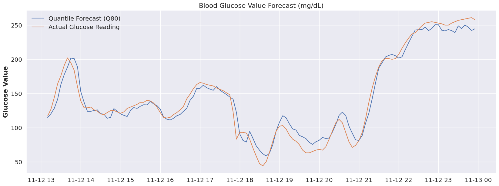
Sadly we’ve reached the end of my dataset and don’t have the ability to test out this hypothesis further, but in my opinion, we’ve pulled on a very interesting thread when it comes to forecasting glucose values.
Wrap-up
Historically we’ve seen models use categorical indicators (such as sleep, meal, etc…) to help the model understand the shifts in an individual’s activities and lifestyle patterns. I think that’s certainly a powerful approach, but here we’re getting the idea that it may be possible to tailor a model more specifically to an individual’s overall “system”, and then start to associate the activities and shifts in everyday patterns to different distributions within the same model.
The benefit to this approach is that we’ve now externalized the association of these patterns. What this would allow us to do is to build another layer of models to start to define these associations of activities and lifestyle patterns to the quantile distributions, allowing for us to adjust these associations far more easily (and frequently) than re-training a model that incorporates them inherently as features.
Conclusion and Where We Go From Here
So after all of this, what do we think? From my perspective, this is clearly a very nuanced and complex domain. This is not the highest scoring model I’ve ever seen for forecasting glucose values, but given the limited data of 9 days (note that the OhioT1D dataset has 8x the observations and has twice as many variables available, across 6 different individuals) I think it holds a tremendous amount of promise. With very little effort we were able to build a model that clearly understood the very dynamic and complex relationships of the input variables with our target variable.
The real value of this exercise is that it demonstrates the promise of neural networks and AI forecasting solutions combined with probabilistic forecasting for understanding glucose values (and more generally, other internal systems of the body). If we were to define certain indicators or modes that the model could reference (for example, an exercise mode, meal times, sleep, illness mode, etc..) we could easily align quantiles and shift between different aspects of the model that are best suited for each mode. We would then have a very flexible model that is capable of being programmatically adjusted, either dynamically by an outer “control” model, or manually by a patient. A user-friendly implementation of this approach would empower patients with a clearer understanding of potential future scenarios and allow for more nuanced and safer decision-making, especially in situations where blood glucose levels can be particularly volatile.
I hope you enjoyed following along, please direct questions as GitHub issues and I’ll do my best to respond.
References
The below resources were invaluable to learning more about TFT’s, Darts and how to perform this analysis.
- Lim, B., Arik, S. O., Loeff, N., & Pfister, T. (2020). Temporal Fusion Transformers for Interpretable Multi-horizon Time Series Forecasting. arXiv:1912.09363 [stat.ML]. Retrieved from https://arxiv.org/abs/1912.09363
- Tena, F., Garnica, O., Lanchares, J., & Hidalgo, J. I. (2021). A Critical Review of the state-of-the-art on Deep Neural Networks for Blood Glucose Prediction in Patients with Diabetes. arXiv:2109.02178 [q-bio.QM]. Retrieved from https://arxiv.org/abs/2109.02178
- Li, K., Daniels, J., Liu, C., Herrero, P., & Georgiou, P. (2019). Convolutional Recurrent Neural Networks for Glucose Prediction. arXiv:1807.03043 [cs.CV]. Retrieved from https://arxiv.org/abs/1807.03043
- Onnen, H. (2021, December 28). Temporal Fusion Transformer: A Primer on Deep Forecasting in Python. Towards Data Science. Retrieved from https://medium.com/towards-data-science/temporal-fusion-transformer-a-primer-on-deep-forecasting-in-python-4eb37f3f3594
- Darts TFT Documentation. (n.d.). Retrieved from https://unit8co.github.io/darts/generated_api/darts.models.forecasting.tft_model.html
- PyTorch-Forecasting Documentation. (n.d.). Demand forecasting with the Temporal Fusion Transformer. Retrieved from https://pytorch-forecasting.readthedocs.io/en/stable/tutorials/stallion.html